fox@fury
Fury 4.0: Redesigning by the book
Saturday, Jun 07, 2003
So hey, I've long found it amusing that so many webloggers with such tight design skills do their redesigns in private, suddenly unveiling them to the world with a big "here it is!"

Trouble is, this is the antithesis of the traditional interaction design process. Showing the design around to a few of your friends shouldn't be a substitute for an actual usability experiment, for a lot of reasons, most notably an inherent bias towards the designer, a familiarity with the existing site (this is useful, but naive users should also be tested), and most importantly, the fact that a person's subjective opinion is not the same thing as the usability of a site.

So I'm going to (more or less) conduct the Fury 4.0 redesign by the numbers. I'm going to do some low-fi prototype testing, some task analysis, a smattering of cognitive walkthroughs for the identified common tasks, and some rolling usability testing as the redesign comes along.

I've already started with a lot of logfile analysis of Fury 3.2. I've identified the five categories of visitors, and their use patterns:

  1. The regular subscriber - You read this site at least once every two weeks, and get here either via a bookmark, by hand-typing the URL, from your RSS aggregator (desktop app, or web-based aggregator), or by a link on your own personal links page (I'm so tempted to link to some of these as examples, but they might be private, so I won't).

    You read comments. Most of you use the timeline bar at the top of the screen. You might lurk, or you might post. Most of you check in at least 3 times a week. Some check several times a day.

    You almost never visit anywhere other than the front page, unless I linked to it in a new article.
     
  2. The general referred user - You saw a link on the sidebar of another site and decided to check it out. You might look around a bit. There's a 30% chance that you'll click on one of the topics in the 'Read by Topic'. If you do, there's an 80% chance that you'll follow the 'sex' topic. There's a 90% chance that you'll be disappointed by it.
     
  3. The specific referred user - A blog or news site you read linked to a specific article on fury, and you followed the link to check it out. When you do, you might visit the front page, and it's just as likely that you'll click on the 'Bio' link to find out more about where you are. You're more likely to become a regular reader than any other group.
     
  4. The google searcher - You dive in and dive out. You'll almost never go anyplace other than the page you land on (unless it's to the aforementioned 'sex' link). On rare occasion you'll actually leave a comment, but if you do, there's (almost exactly, strangely enough) a 50% chance that you're either a crackpot, conspiracy theorist, extremely vulgar, immature, or some combination. Trouble for you is that, though you don't know it, almost nobody will ever know you left that comment, unless they constantly scour the archives for recent comments.
     
  5. Kevin Fox - I use Fury differently than everyone else. When it doesn't suit my needs, I've built hacks in the back end so that I can do what I want. When someone leaves a comment on the site, it automatically emails the comment to me, so I never have to check back to find new content, and can respond to comments right away.

    I have hidden pages where I can get up-to-the-second lists of who came to what page of the site, and where they came from. I can spot new referring links easily, and see how popular that link is.

    I use the timeline bar as a guilt-o-meter, always wanting to see at least some dark blue on the page, lest I feel the page is growing stale.

I've spent the last several months with these use patterns in my head, and they have driven a few changes over the years (the timeline, color-coding, permalinks, comments, etc.) but now I've got enough new ideas that I'm doing a complete rewrite. I closely considered making it 100% CSS, but I found that while the concept of CSS is extremely elegant, in practice the compatibility differences amongst my target browsers (even between IE 5.5 and IE 6.0, browsers of the most common Fury visitors) mean that I'd have to code many kludges just to make it work right, and it would make me more reluctant to institute changes, knowing a small change could wreck the site.

Instead I'm using tables for layout, and CSS for styles, as I mostly do now.

Okay, this post is getting much longer than I intended. Back to the interaction design model, I want your input. I'd like the regular users to be the eyes over my shoulder, I want you guys to play the role of the stakeholder. I'm designing a tool both for you and the other four groups, and while I'll take your comments for what they are, and not gospel, I realize you guys have a lot of good ideas and frustrations, and as long as this post's comments inform the design, and don't drive it, I think it'll make for a better redesign all around.

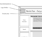
Mmm.. Wireframe...So, knowing that many of the labels in the following wireframe will need description I won't delve in to until later this week, I'd like to share the preliminary Fury 4.0 home page wireframe.

Questions? Comments? Go for it.

If you like it, please share it.
aboutme

Hi, I'm Kevin Fox.
I've been blogging at Fury.com since 1998.
I can be reached at .

I also have a resume.

electricimp

I'm co-founder in
a fantastic startup fulfilling the promise of the Internet of Things.

The Imp is a computer and wi-fi connection smaller and cheaper than a memory card.

Find out more.

We're also hiring.

followme

I post most frequently on Twitter as @kfury and on Google Plus.

pastwork

I've led design at Mozilla Labs, designed Gmail 1.0, Google Reader 2.0, FriendFeed, and a few special projects at Facebook.

©2012 Kevin Fox