| fox@fury | ||||
|
Thursday, Apr 11, 2002
Another example of sensationalism:
That graph shows yahoo stock over the last five years, and is only shown because it looks pretty 'ooh! look at that!'
This is a particularly good example of how looking at the same stock at three different levels of granularity gives three completely different stories to support whatever point you'd like to make. If you like it, please share it.
|
aboutme
Hi, I'm Kevin Fox. I also have a resume. electricimp
I'm co-founder in The Imp is a computer and wi-fi connection smaller and cheaper than a memory card. We're also hiring. followme
I post most frequently on Twitter as @kfury and on Google Plus. pastwork
I've led design at Mozilla Labs, designed Gmail 1.0, Google Reader 2.0, FriendFeed, and a few special projects at Facebook. ©2012 Kevin Fox |
|||
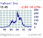 In no fewer than three articles I read about Yahoo today, they had some version of the graph on the right in the article.
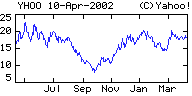 On the other hand, a graph of the last 12 months tells a different story, of a stock that dropped 50% in value and has fought its way back up.
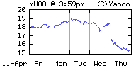 Now take a look at the graph for the last five days of Yahoo trading. This is the one that fits the story, talking about the earnings release and subsequent dive.